
1. The Art of Inconsistency
In the world of design, consistency is often hailed as the holy grail of user experience. It helps users navigate familiar territory and creates a sense of cohesion. However, the overuse of consistency can lead to designs that are monotonous and uninspiring.
In this article, we'll explore how a touch of inconsistency can transform your design from dull to dynamic, drawing attention and creating memorable experiences.
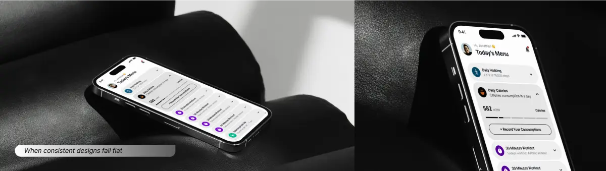
When Consistent Designs Fall Flat Consistency is crucial in design because it helps users understand and predict how to interact with a product. But when overused, it can make designs repetitive and uninspiring.
Imagine a website where every element looks exactly the same—after a while, it becomes visually boring and fails to engage users.

A well-placed touch of inconsistency can make certain elements stand out and capture user attention. For example, using a contrasting color or a unique layout for a call-to-action button can draw users’ eyes to it immediately.
Just like a chef uses spices to enhance a dish, designers use inconsistency to highlight important features.
2. Types of Consistency
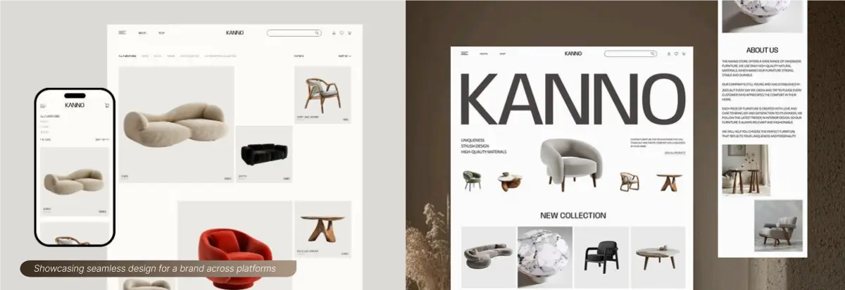 Internal Consistency: This refers to maintaining uniformity within the same product or site. It includes consistent navigation, color schemes, typography, and layouts.
Example: Xfinity's inconsistent secondary navigation on different pages creates confusion because users expect a uniform experience across the site.
External Consistency: This pertains to maintaining consistency across different platforms or related sites. It ensures users recognize and understand the design language wherever they encounter it.
Example: Adobe’s inconsistent icon styles in their menu can confuse users about the nature of different products.
3. How to Break Consistency with Purpose
 Breaking consistency isn’t about disregarding design principles but about knowing when and how to do it effectively Draw Attention: Use inconsistency to highlight key elements. For example, a brightly colored banner in an otherwise uniform design grabs attention.
Enhance Usability: Sometimes, a small deviation from the norm can improve user experience. For instance, placing related actions apart can prevent accidental clicks and improve decision-making.
4. Crafting the Perfect Recipe for Design
Inconsistency, when used wisely, is like a spice in cooking
To create a balanced design :
1. Identify Key Elements: Determine which elements need to stand out and apply inconsistency sparingly.
2. Maintain Core Consistency: Ensure that essential elements like navigation and core functionalities remain consistent.
3. Moderate Use: Apply inconsistency in moderation to avoid overwhelming users.
At Rsquare Web Studio, we champion the art of strategic inconsistency to elevate design from mundane to magical. By thoughtfully applying deviations, we create engaging and memorable experiences. Remember, just a dash of inconsistency can turn a good design into a great one.
Ready to spice up your designs? Let’s connect and make it happen!
Conclusion
Inconsistency, when used thoughtfully, is a design superpower. By balancing core uniformity with subtle deviations, you can craft experiences that captivate and resonate. Remember, just a dash of inconsistency can turn a good design into a great one. Ready to add some spice to your designs? Let’s make it happen!